
4D for iOS: Custom Input Controls
October 5, 2021
5 min read

Until now, custom formatters allowed you to match text or images to the contents of a field, such as replacing true/false with an image or 1, 2 with text labels. 4D v19 R3 allows you to create action input controls available from actions forms, such as creating a choice list with predefined text. And even better, this list can be dynamically filled using a datasource such as a list of employers. Let’s delve into the details!
Custom formatters allow you to deal with enumerations using a simple JSON file to display corresponding values depending on your database values.
Here is an example of the manifest.json file :
{
    "name": "integerToString",
    "type": [
        "integer"
    ],
    "binding": "localizedText",
    "choiceList": {
        "0":"To Do",
        "1":"In Progress",
        "2":"Done"
     }
}
This simple JSON file allows you to convert integers into strings to be displayed in your iOS app. But you can also create and use those types of formatters to display pictures, integers, emojis…
Dropping them in a specific “formatters” folder, you can assign them to a text field, for example, to get that kind of result:
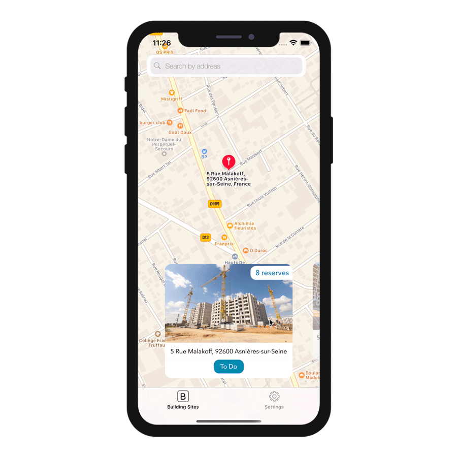
The status field values “To Do”, “In Progress,” and “Done” at the bottom of the screen are correctly displayed according to the integer value in your database.
It’s a straightforward way to display formatted values in your mobile apps. The bonus is that those choice lists are automatically used in your action forms, allowing you to select one of the values in the list to use it as a parameter. But one of the limits is that those lists are static because they’re based on a JSON file.
Now let’s talk about input controls! This new feature will allow you to create:
This will guarantee you always have up-to-date lists directly accessible from your mobile app!
Those action input controls are straightforward to create and very easy to use. To use them in your mobile projects, just as for formatters or custom list and detail forms, you’ll need to include them in your database in a special “inputControls” folder (my base/Resources/mobile/inputControl).
Those action input controls will then be available and selectable in the Action section, in the parameter properties, filtered by the type of your action parameter and the way you want to display your lists using formats.
Let’s focus on formats because it’s quite a new concept. Basically, formats allow you to define the way you want to display your lists on the mobile app side:
Now let’s have a look at some examples!
Here is an example of a manifest.json file that can be used as a static choice list:
{
    "name": "choiceListSheet",
    "type": [
        "text"
     ],
    "format": "sheet",
    "choiceList": {
        "1":"Vincent",
        "2":"David",
        "3":"Anass",
        "4":"Eric",
        "5":"Quentin",
        "6":"Houssam"
     }
}
Very similar to customs data formatter, right? As you can see, a simple static list is defined here for this action input control with a “sheet” display format.
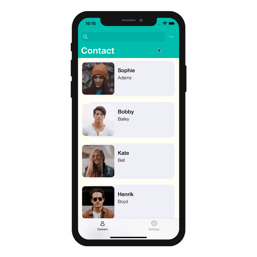
And here is an example based on a Contact data class and a LastName attribute.
{
    "name": "datasourcePush"
    "type": [
        "text"
    ],
    "format":"push",
    "choiceList": {
        "dataSource": {
            "dataClass": "Contact",
            "field": "LastName",
            "entityFormat": "%FirstName% %LastName% - %Job%",
            "search": "LastName",
            "order": "descending"
        }
    }
}
The updated contact list will be accessible as a list in the action form of your mobile app, based on the Contact data class with a “push” display format.
We will see that later, but the great thing is that you can define smart options in your manifest.json file, such as displaying a search bar or how you want to sort your lists!
In this example, the push, the popover, and the picker display lists based on a datasource. You can add a search defining the “search” value for the “push” display format, a sort option defining the “order” value, as well as your data’s display format (by defining the “entityFormat”). For example, for the picker input control:
And best of all, those list are available even if you are offline!
As a first step, you’ll have to create your action input control from your favorite code editor, following examples from this blog post or the documentation.Then you’ll need to add them in the “inputControls” folder (my base/Resources/mobile/inputControl).
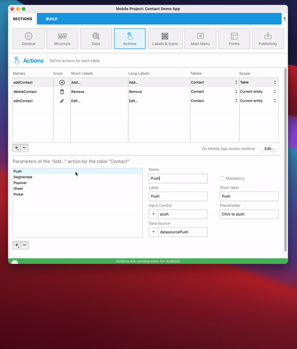
Back to the project editor, your input controls will be available and filtered by your parameter’s type and the previously defined format in your JSON file.
And as you can see with this example, it is quite easy to create static choice lists and lists based on datasources to guarantee the best experience for your mobile users!
Don’t hesitate to give us feedback on the 4D forum, and check out the documentation for more details!
Got a question, suggestion or just want to get in touch with the 4D bloggers? Drop us a line!
* Your privacy is very important to us. Please click here to view our Policy
Comments are not currently available for this post.