
QODLY STUDIO FOR 4D: WHAT’S NEW IN 4D 20 R5
July 22, 2024
4 min read

In our previous posts, we introduced you to Qodly Studio for 4D and hope you have begun exploring its features. With each release, Qodly Studio for 4D becomes an increasingly robust and user-friendly solution for building business web applications with minimal coding effort.
Integrated deeply with 4D, Qodly Studio for 4D allows you to leverage existing business logic developed for desktop applications.
Let’s dive into the exciting new features of Qodly Studio for 4D 20 R5 and how you can integrate them into your applications.
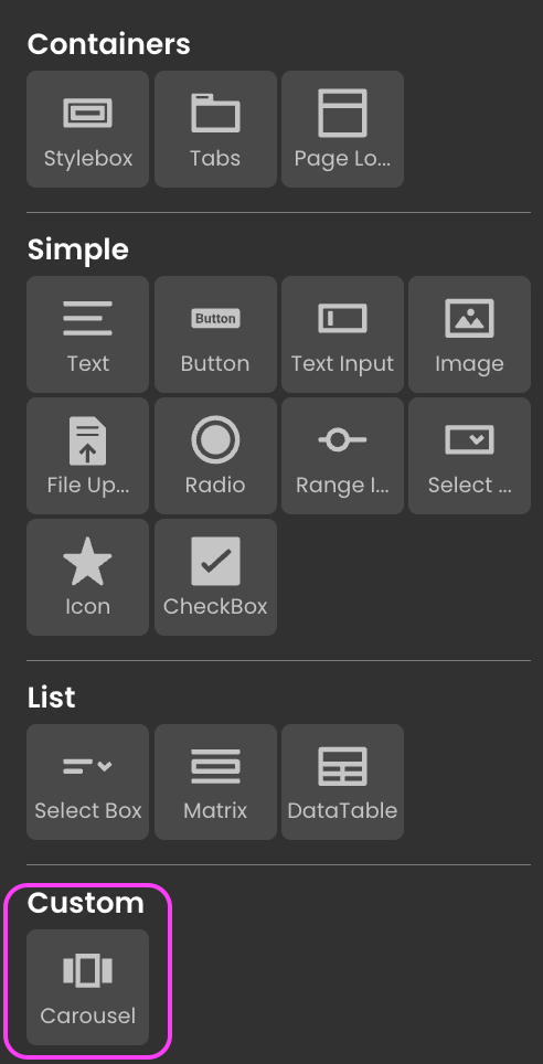
Qodly Studio already provides a suite of useful components. The latest release introduces the concept of Custom Components, empowering you to create and integrate your personalized components and unlocking endless possibilities for your apps.
Crafted with ReactJS, these custom components provide developers a flexible and robust foundation. They can be easily imported into Qodly.
Explore our GitHub repository for ready-to-use custom components created by the Qodly community. Whether you need an intelligent carousel to display images or other functionalities, you can easily download and import them into your apps.
For example, if you need an intelligent carousel component to display images, simply download it from the GitHub repo, import it, and use it in your app!
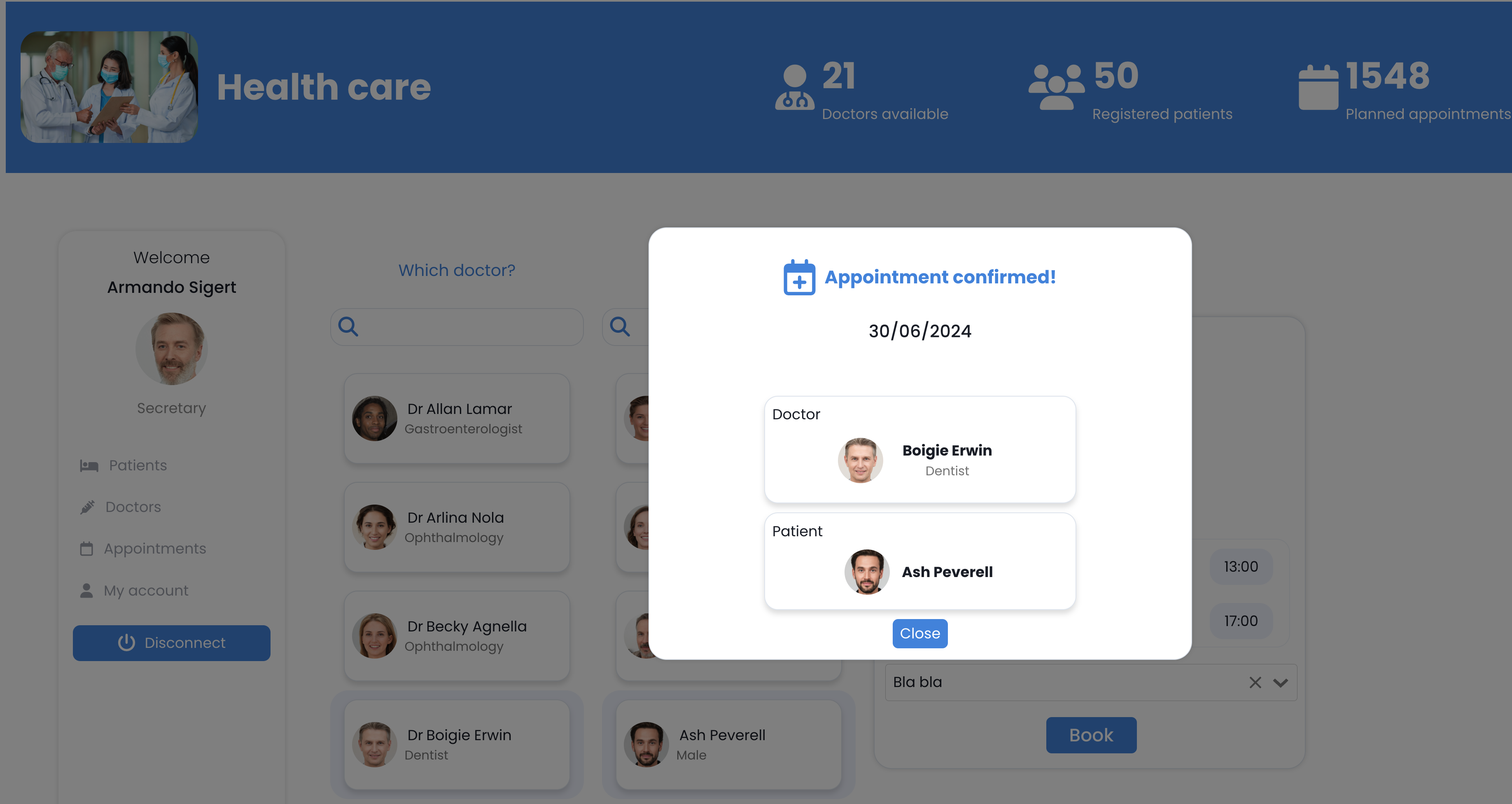
The 20 R5 release enhances user experience with new dialog capabilities, allowing you to display confirmation popups and other dialog types.
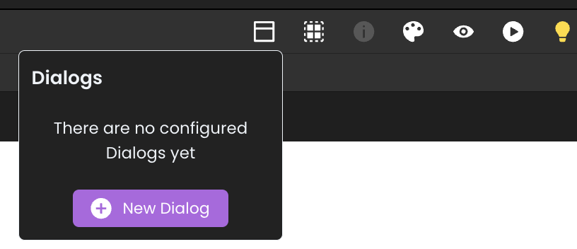
Check the documentation to learn more about implementing these features.
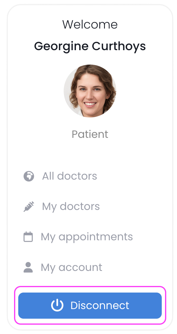
With the new Force Login mode, a 4D Client license is consumed only when users successfully log in and start working with the application’s data and logic.
Qodly Studio for 4D now offers the ability to quit the session and free a 4D client license. This feature allows you to provide a disconnect functionality in your application. Read more about it in this blog post.
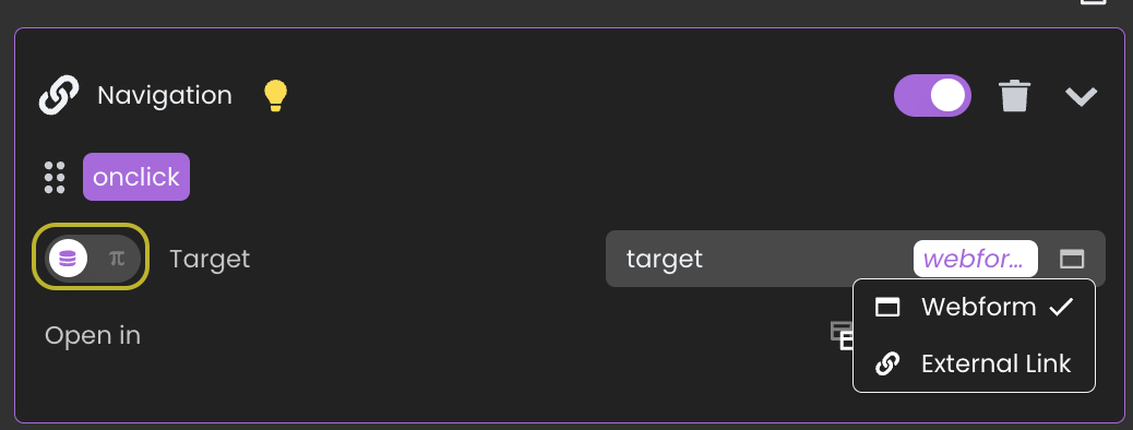
Qodly’s already powerful navigation actions have been enhanced further. Now, you can navigate to a Qodly page or an external link with values provided by a data source, offering greater flexibility in your application’s navigation structure.
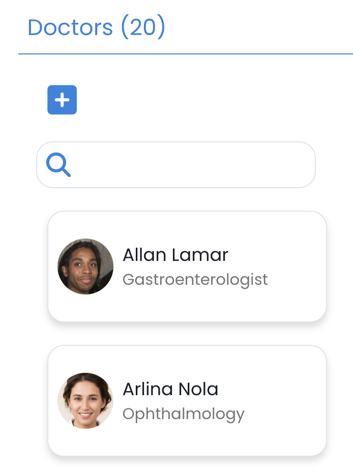
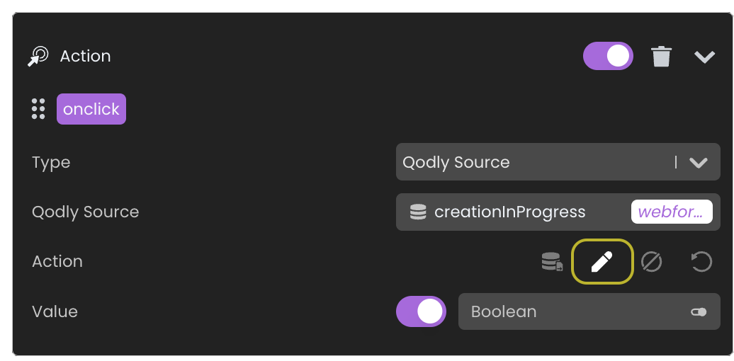
A new standard action is available to set a value for a data source without handling a server-side function.
For instance, when you click on the + icon to indicate a creation, a boolean can now easily be managed to reflect this action.
So easy to do that now!
Other parts have been enhanced to ease the developer’s life.
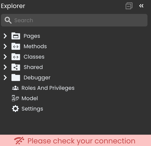
When the network connection is lost and 4D is not reachable, an error message is displayed promptly informing the end user.
When inspecting a component in the properties panel, the last active tab (component, data source, or CSS) remains selected when switching between components, making it easier to compare settings.
In this video, we can navigate from one style box to another and compare the greenCart and blueCart CSS classes.
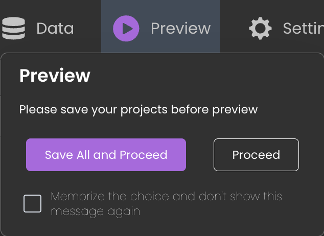
A warning is displayed when there are unsaved items before previewing the application. You can choose to ignore it or save all items.
This behavior can be enabled or disabled via the user setting Show Unsaved Files Popover.
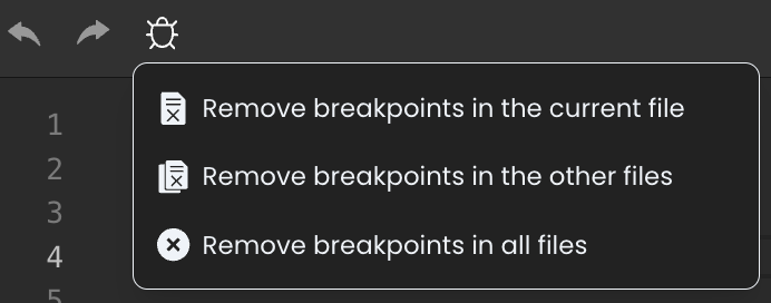
Removing breakpoints in the debugger is now more straightforward, and several options are available in debug mode.
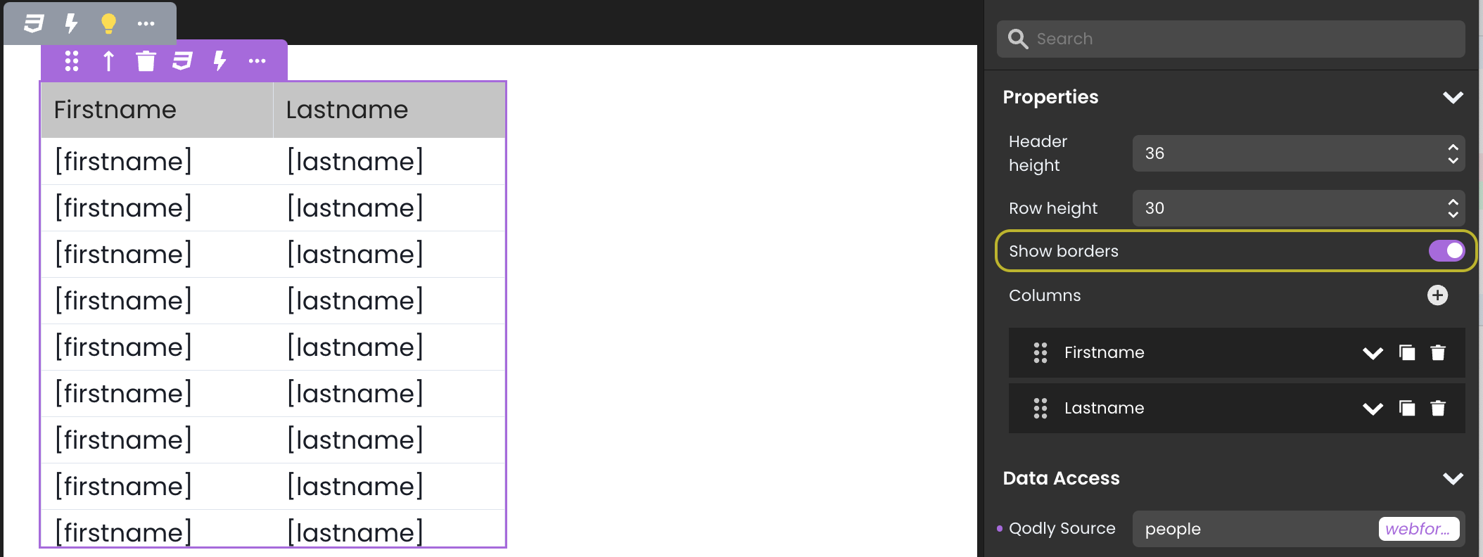
A new Show borders property is available for the datatable component, allowing for a more precise visual distinction.
Leveraging these new features can enhance your application’s functionality and development experience. We encourage you to explore these updates and see how they can improve your projects.
Happy developing!
Got a question, suggestion or just want to get in touch with the 4D bloggers? Drop us a line!
* Your privacy is very important to us. Please click here to view our Policy
Comments are not currently available for this post.