
Evolution of Form Objects
April 28, 2023
3 min read

To allow you to make the most beautiful interfaces, we continue to improve the form objects. Since 4D v19 R6, you can define a rounded border for static text and input text form objects.
With 4D v20, new possibilities are available.
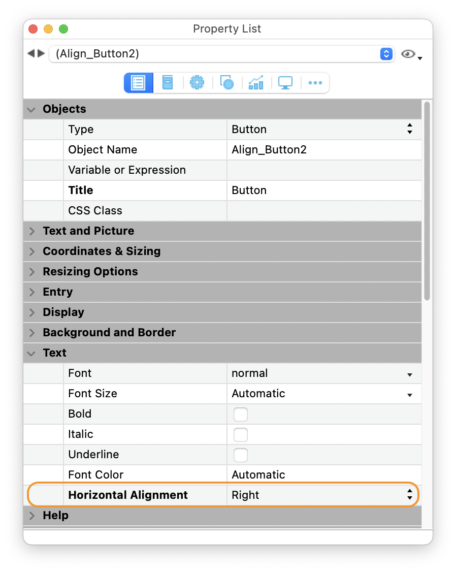
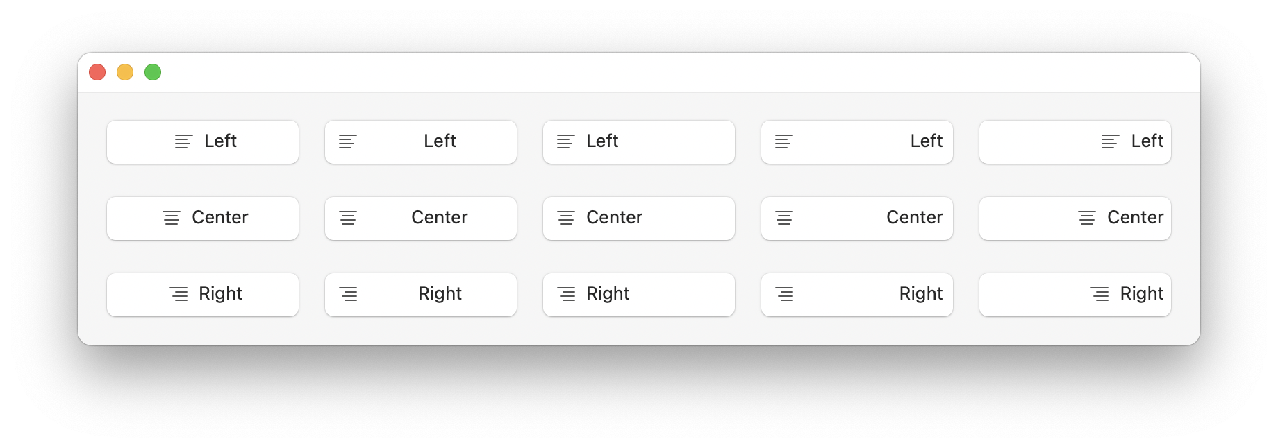
The “Text alignment” property is now applicable for buttons, radio buttons, and checkboxes. You can define the text alignment with the property list, CSS, and OBJECT SET HORIZONTAL ALIGNMENT command.
Property list:
CSS example:
.align {
    textAlign : right;
}
Code example:
To the OBJECT SET HORIZONTAL ALIGNMENT command, you can pass one of the three constants: Align left, Align right, and Align center.
OBJECT SET HORIZONTAL ALIGNMENT (*; "button"; Align center)
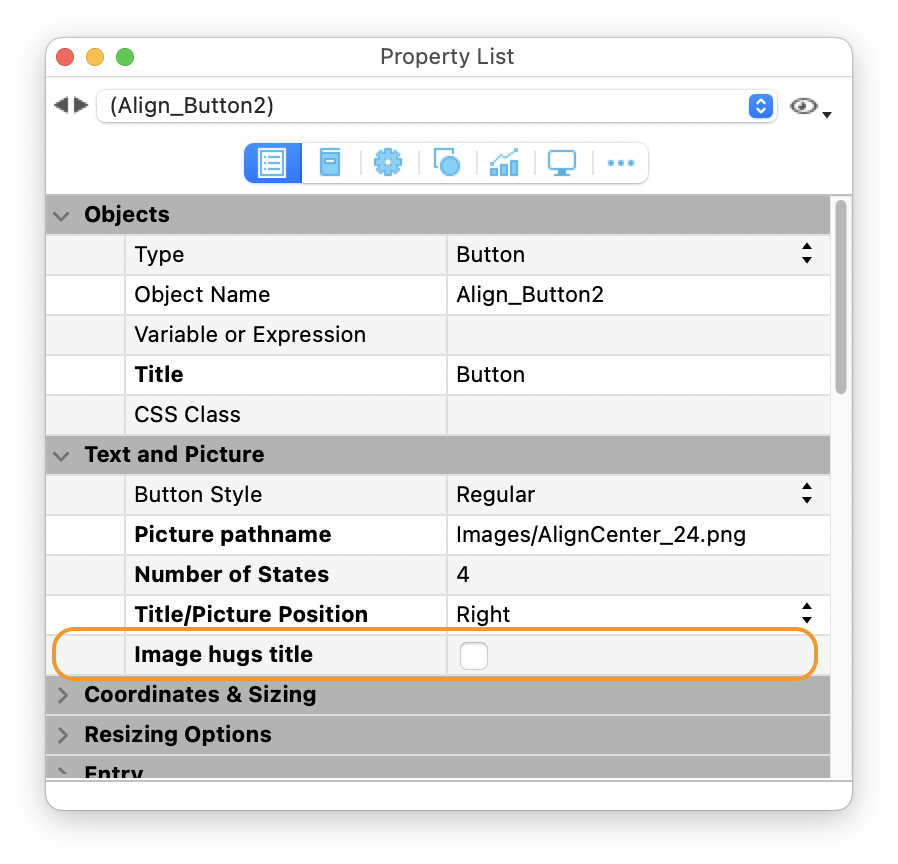
The new “Image hugs title” property is added for buttons, radio buttons, and checkboxes.
When the value of this property is false, the image is positioned according to the “Title/ImagePosition” property at the edge of the button. When this property is true, the image is positioned directly adjacent to the title based on the “Title/ImagePosition” property.
This property can be set with the property list, CSS, and OBJECT SET FORMAT command.
Property list:
CSS example:
.hug {
    imageHugsTitle : false;
}
Code example:
To format buttons, with the OBJECT SET FORMAT command, pass a string respecting the following syntax: “title; picture; background; titlePos; titleVisible; iconVisible; style; horMargin; vertMargin; iconOffset; popupMenu; hyperlink; numStates; imageHugsTitle“. If you don’t want to modify a value, you don’t need to pass the value.
To change only the imageHugsTitle property:
OBJECT SET FORMAT (*; "button"; ";;;;;;;;;;;;;0")
Here are different examples of what we can achieve:
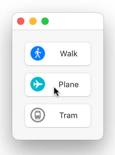
For radio buttons and checkboxes, before 4D v20, you can define a four-state icon for True, False, Rollover, and Disable states.
For a better end-user experience, in some cases, you need the rollover or disable state to consider the true or false state. So now, you can use an icon with 2 states up to 6 states.
Feel free to download the HDI to see the different states by clicking, hovering…
Check out this feature with the HDI and the documentation for more details! And as always, looking forward to reading your feedback.
Got a question, suggestion or just want to get in touch with the 4D bloggers? Drop us a line!
* Your privacy is very important to us. Please click here to view our Policy
Comments are not currently available for this post.