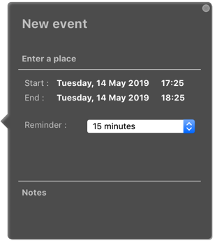
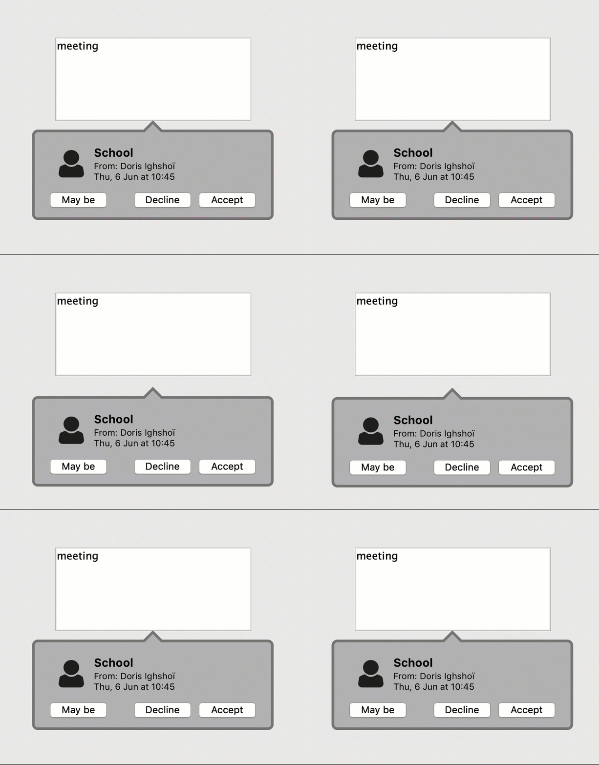
Have you ever been flooded by confirmation dialogs, alert boxes, and contextual help windows that make it nearly impossible to locate the form window on which you were working? Wouldn’t it be more user-friendly to stay on the same page and see help bubbles pointing directly at the original target?
This is possible thanks to the 4D component AJUI_Tip. It’s a powerful tooltip engine based on the technologies available in 4D such as ORDA, New Formula, SVG, SubForm, CALL FORM, to name a few. In this blog post, we’ll highlight the component’s usage, and show how you can design beautiful tooltips to enhance your applications’ UI. A download link can be found at the end of the blog post.
What is AJUI_Tip
AJUI_Tip is a 4D component that allows you to dynamically generate and display tooltips (Tip) in the context of a form. The component offers several methods to customize and manipulate tips via an object and functions.

The component is composed of three elements:
- An image variable: The component builds the image from a number of properties in SVG language. The result is a set of calculations based on different criteria (content size, padding, radius, etc.) that will be used to draw the outline of the tooltip and its arrow. The SVG can can also integrate a text box and a button (to close the tooltip).
- A subform: You can integrate a form from the main database into the tooltip. The subform, if defined, takes the place of a text box.
- An object variable: Maintain tooltip properties during various operations of the component.
Hello world
Setting up your first tooltip can be summarized in four steps:
- First, you need to call the new AJUI_Tip initialization method to retrieve an object and an instance with all the properties and formulas of a default tooltip. We recommend using the “Form” variable directly to store the current instance in order to easily navigate between your form method and your form objects.
Form.Tip:= new AJUI_Tip
- Use your object’s formulas to define the properties of the tooltip instance, according to your needs.
Form.Tip.TipName("test")

Form.Tip.TextLabel("Hello World")
- Define a name that will remain associated with the tooltip instance.
- Make sure you define a text to display. This text can be styled (e.g., words or letters in bold, italic, or color in a text box).
- Finally, use the “show” formula to launch the generation of the tooltip instance. For example, you can test it on one of your form objects with an “On Clicked” event.
Case of

   : ($evt=On Clicked)

       Form.Tip.show()

End case
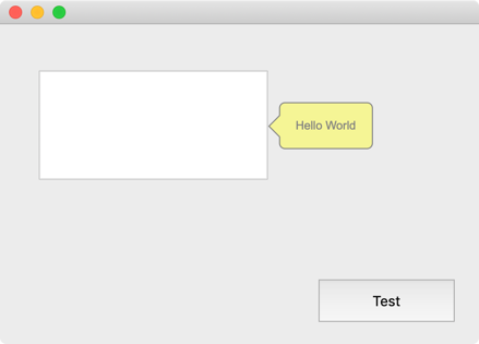
Following the previous steps, you should see something like the image below. Congratulations, you’ve created your first tooltip!

animate your tooltips
How about making your tooltip even more expressive? Well, AJUI_Tip lets you animate these little bubbles with different animation styles (e.g., fade in and out, blink, jump, etc.).

AJUI_Tip in depth
This post has barely scratched the surface of this powerful component. More details, as well as a step by step tutorial on its use and configuration, are available here. You can also download it. Enjoy!


Comments are not currently available for this post.