
Extend your Qodly application with custom components
March 28, 2025
5 min read

4D Qodly Pro already offers a wide range of native components to help you design your applications. But did you know you can take it even further? Thanks to Custom Components developed by the community, you can enhance your projects with tailor-made features!
These custom components allow you to extend 4D Qodly Pro’s capabilities by adding personalized functionalities, much like plugins and components in 4D.
In this article, we’ll explore how to use and integrate these components, along with several real-world use cases from our Performance Review application.
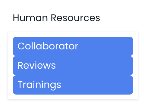
Performance Review Application
Custom Components are building blocks created by users to meet specific needs or add functionalities not covered by 4D Qodly Pro’s built-in components. Developed in React, they provide a powerful and flexible foundation for developers.
Integrating Custom Components into Qodly Studio offers several advantages:
For more information, check out the official documentation: Upload Custom Component.
If you can’t find a component that meets your needs, you can create your own.
4D Qodly Pro’s API simplifies the creation of Custom Components in React with its dedicated CLI tool, @qodly/cli. This tool streamlines the initialization of a React project, allowing developers to design and share reusable components. Once integrated, these components can be added to Pages with a simple drag-and-drop.
Check out the official documentation for more details.
In the Performance Review application, we integrated several Custom Components to enhance the user experience. Here are some concrete examples:

We use the pdfViewer component.
Steps to integrate a PDF viewer:
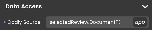
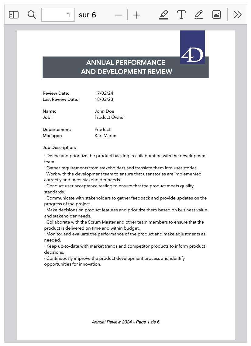
This component is particularly useful for displaying documents dynamically generated from a 4D Write Pro template and database data.
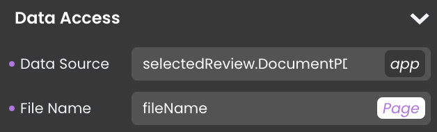
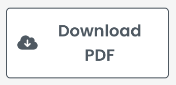
The fileDownload component allows you to download documents.
Steps to create a file download option:
In our Performance Review application, we integrated a menu at the top of the page, placed above a Page Loader widget. This menu dynamically determines the page to be loaded within the Page Loader component. We created the menu with the popover component.
Steps to create the menu:
With a few style adjustments, we get a functional and ergonomic menu:

By fine-tuning the design, adjusting spacing, colors, and hover effects, you can create a seamless and user-friendly navigation experience in your Qodly application.
4D Qodly Pro offers a native component for date selection. However, in the Performance Review application, we opted to use the custom DatePicker component, as its design better suited our needs. This also allowed us to demonstrate the combination of Custom Components.
Steps to create a custom year input:
With a few style adjustments (borders, colors, etc.), here’s the result:
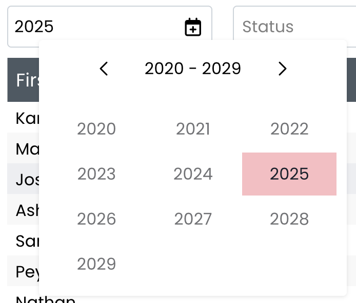
This approach combines flexibility and a customized design, enhancing the user experience.
Custom Components are a powerful solution to enhance your Qodly applications and meet specific needs without complex development. Explore the GitHub repository for components to discover even more possibilities.
If you’ve created your own component, share it with the Qodly community!
To go further, check out this tutorial video: How to add custom components to your Qodly app.
Got a question, suggestion or just want to get in touch with the 4D bloggers? Drop us a line!
* Your privacy is very important to us. Please click here to view our Policy
Comments are not currently available for this post.