
Designing an Interactive and Dynamic Menu Bar in Qodly application
April 7, 2025
7 min read

In this week’s blog, we take a look at navigation. Navigation is a key element of any web application. A well-structured navigation system enables users to quickly find what they need and enhances their overall experience.
With 4D Qodly Pro, managing navigation is both simple and flexible. Using the Page Loader component, you can dynamically load pages based on user actions.
In this article, we will explore how to set up an efficient navigation bar using 4D Qodly Pro. We will use our Performance Review application as an example, which you can download from GitHub (link to be added). We will cover its design, interactions, and permission management to create a seamless experience tailored to each user role.
Performance Review Application

Loading a page with 4D Qodly Pro is intuitive. Simply drag and drop the Page Loader component onto your interface and associate it with a text-based datasource.
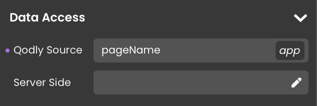
The Page Loader automatically loads the page corresponding to the value stored in the datasource. By updating this value, users can navigate seamlessly between different pages in the application.
Now that we understand how to load pages using the Page Loader, we need to determine how to dynamically modify this datasource to facilitate smooth and intuitive navigation.
There are three primary types of navigation:
The navigation type should be chosen based on the specific needs of your application and target users. A well-designed navigation system improves user experience and ensures easy access to key functionalities.
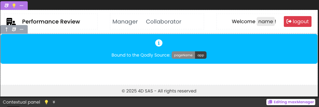
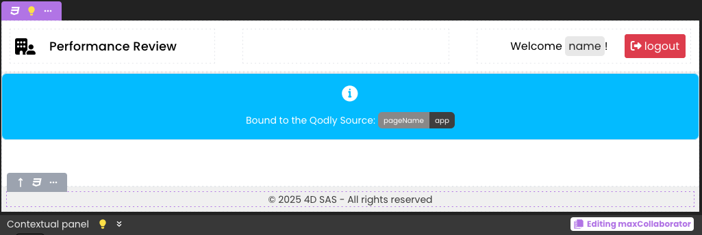
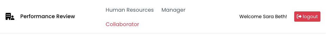
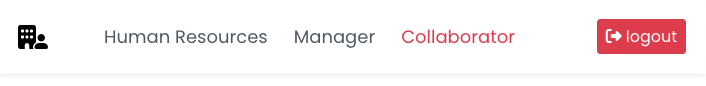
For the Performance Review application, we opted for a classic menu bar. This approach allows quick access to different sections while ensuring a smooth experience on both desktop and tablet devices.
Our navigation bar is designed to be simple, efficient, and user-friendly. Here are its main features:
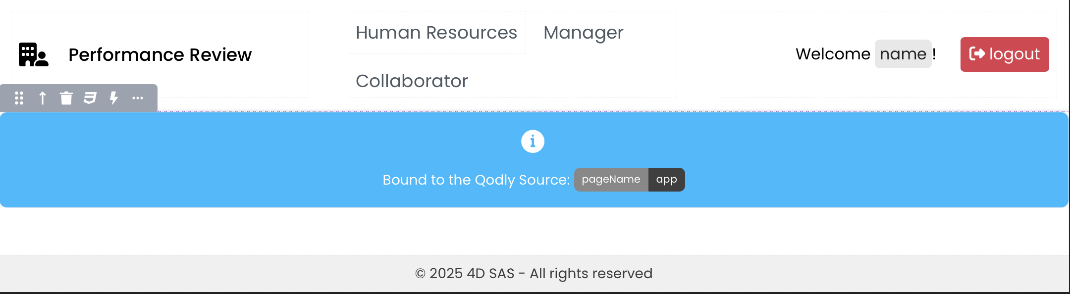
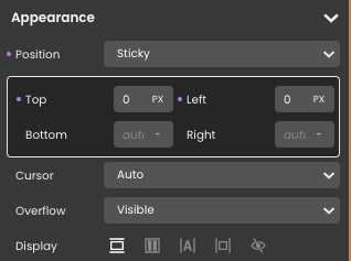
The navigation bar is displayed at the top of the screen at all times. To achieve this, we create a style box with a sticky property:
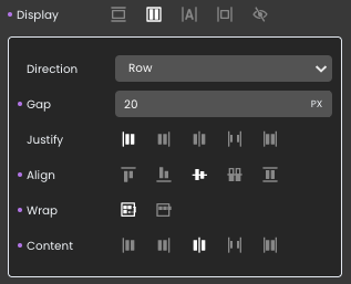
We use a style box with Flexbox to align elements and maintain responsiveness across various screen sizes.
Inside this box:
A second style box (using Flexbox) is added to contain both the dropdown menu and the two navigation buttons.
Creating the “Human Resources” Dropdown Menu
To create the dropdown menu, we use a custom component called Popover. You can download this component from GitHub.

For more details on custom components, refer to our previous blog post: “Extend our Qodly application with custom components”
Adding the Manager and Collaborator button
Simply add two separate buttons labeled “Manager” and “Collaborator.”
A third style box (using Flexbox) is used to display the logged-in user’s name and provide a logout action.
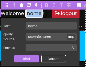
For more details on authentification, check out this previous blog post: Integrating user authentication in your Qodly applications.
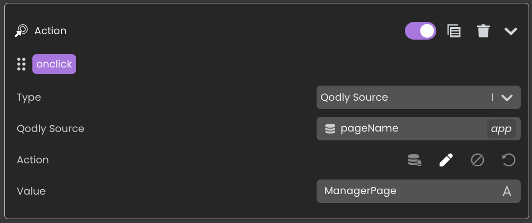
Navigation is managed through a variable called pageName, which acts as the datasource for the Page Loader.
This approach ensures a smooth and fast navigation experience without reloading the application.
Not all menu buttons are visible to every user. Their visibility depends on user roles:
We use state management to dynamically control which options are visible based on the logged-in user’s role.
A Manager has a dual role:
To handle this, we define two datasources:
Populating the Datasources:
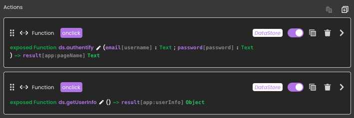
During authentication, using the ds.authentify() function, user information is stored in session storage:
var $obj : Object

$obj:=Session.storage


If ($obj.Employee=Null)

  Use ($obj)

   $obj.Employee:=New shared object

  End use

End if


Use ($obj.Employee)

  $obj.Employee.ID:=$employee.ID

  $obj.Employee.name:=$employee.Firstname+" "+$employee.Lastname

  $obj.Employee.role:="Collaborator"

  $obj.Employee.maxRole:="Collaborator"

End Use
A helper function getUserInfo() is provided to retrieve user details within Web page:
exposed Function getUserInfo : Object

  If (Session=Null)

   return Storage.Employee

  Else

   return Session.storage.Employee

  End if
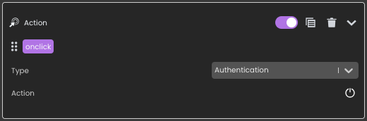
On the login button’s onClick event, both functions are called:
Creating and Configuring States:
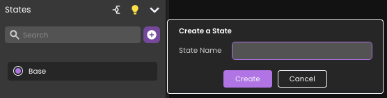
Define conditional display rules:
We want:
These rules are easily implemented using Qodly Studio’s conditional state configuration editor.
maxCollaborator
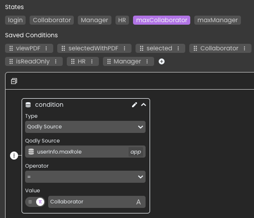
maxManager
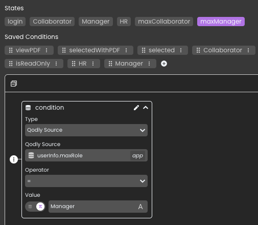
For more details on state management, check out our previous blog post: Make your Qodly applications dynamic and interactive with states.
Other states exist to manage the menu, the login window, or the selected menu item. It’s up to you to explore how it is configured, and feel free to join us on the forum if you have any questions.
Our application is designed for both desktop and tablet usage. To ensure an optimal user experience, the navigation bar is fully responsive.
Dynamic hiding of elements is managed via CSS media queries (e.g., using max-width), while Flexbox with the Wrap option ensures the menu automatically adjusts based on available space.

For further insights into CSS customization in Qodly Studio, refer to our previous post: Customize your Qodly interfaces with CSS.
You now have the essential elements to create an interactive and dynamic navigation bar with 4D Qodly Pro.
We encourage you to share your implementations and ask questions on the 4D Forum to continue engaging with the community.
Got a question, suggestion or just want to get in touch with the 4D bloggers? Drop us a line!
* Your privacy is very important to us. Please click here to view our Policy
Comments are not currently available for this post.