
Customize your Qodly interfaces with CSS
April 3, 2025
5 min read

In Qodly Studio, each widget can be styled directly using its properties. However, to maintain a consistent look throughout your application, and to easily apply global styles (such as font color, text size, or the appearance of selections), CSS is your best ally.
In this article, we’ll explore the basics of using CSS in Qodly Studio, with examples from the Performance Review application.
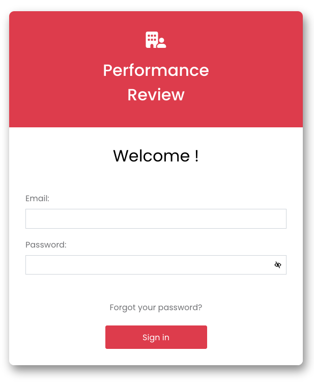
Performance Review Application
CSS (Cascading Style Sheets) is a style language for controlling the visual appearance of HTML elements on a web page. They are used to define colors, fonts, margins, animations, and much more, to create consistent, aesthetically pleasing and adaptable interfaces.
In this blog, we’ll just show you how to use and create a CSS class in Qodly Studio, as well as a few simple examples. If you want to learn how to write CSS, there are numerous documentation sources, training courses and videos on the subject.
Qodly allows you to add CSS classes directly to your project. Here’s how:
Qodly offers three types of CSS for maximum flexibility:
These options give you great flexibility in structuring and managing your styles.
Once you’ve created your CSS, you can apply a class to different widgets in just a few steps:
Let’s take the Login page from the Performance Review application as an example.

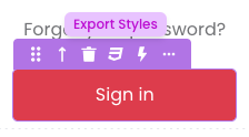
We want to style the login button with:
We create a “button-full” class.
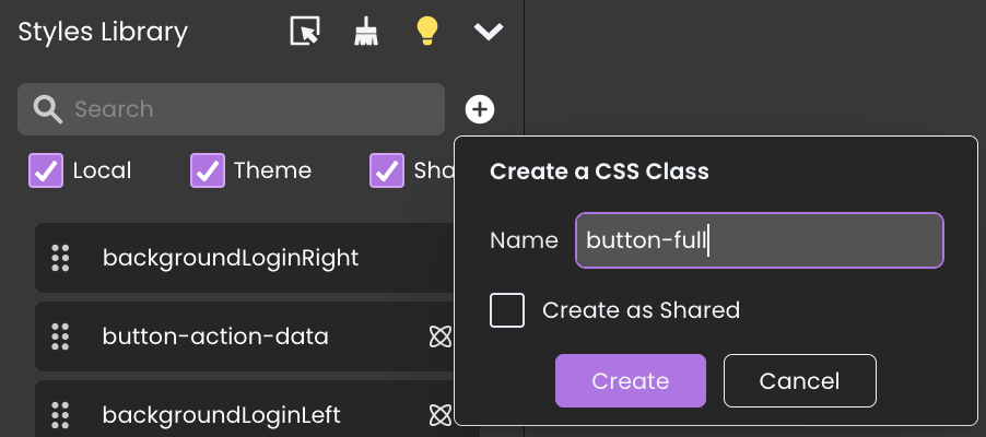
We enter the following CSS description:
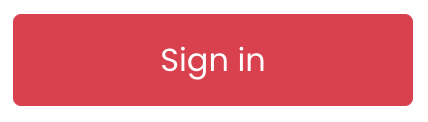
self {
  border-radius: 4px;
  border: 1px solid #dd3c4c;
  background-color: #dd3c4c;
  color: #FFFFFF;
  transition-duration: 0.4s;
}

self:hover {
  border: 1px solid #c32232;
  background-color: #c32232;
  color: #FFFFFF;
}
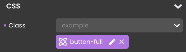
In Qodly Studio, apply this style using the “button-full” class on your buttons.
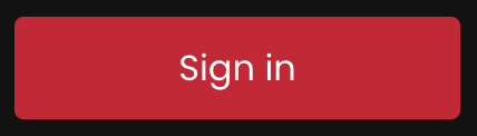
With media queries, you can create adaptive styles that automatically adjust based on the user’s light or dark theme.
For dark mode, we want a darker red with a lighter hover effect. This is easily achieved using the @media (prefers-color-scheme: dark) selector:
self {
  border-radius: 4px;
  border: 1px solid #dd3c4c;
  background-color: #dd3c4c;
  color: #FFFFFF;
  transition-duration: 0.4s;
}

self:hover {
  border: 1px solid #c32232;
  background-color: #c32232;
  color: #ffffff;
}

@media (prefers-color-scheme: dark) {
  self {
    border-radius: 4px;
    border: 1px solid #c32232;
    background-color: #c32232;
    color: #ffffff;
    transition-duration: 0.4s;
  }

  self:hover {
    border: 1px solid #dd3c4c;
    background-color: #dd3c4c;
    color: #ffffff;
    }
}
The result in images:
Light theme
Dark theme
CSS variables allow you to define reusable constants, making style management easier and more dynamic.
For example, you can centralize color management and apply them dynamically based on light or dark mode.
Create a shared stylesheet and define all your constants:
:root {
   --main-bg-color: #FFFFFF;
   --main-fg-color: #000000;
   --accent-color1: #dd3c4c;
   --accent-color2: #c32232;

  @media (prefers-color-scheme: dark) {
    --main-bg-color: #121212;
    --main-fg-color: #E0E0E0;
    --accent-color1: #c32232;
    --accent-color2: #dd3c4c;
  }
}
To use a variable in a CSS class, simply use the var() function:
self {
  border-radius: 4px;
  border: 1px solid var(--accent-color1);
  background-color: var(--accent-color1);
  color: var(--text-color1);
  transition-duration: 0.4s;
}

self:hover {
  border: 1px solid var(--accent-color2);
  background-color: var(--accent-color2);
  color: var(--text-color1);
}
Now, whenever you update the color variables, all styled elements will automatically update, ensuring a consistent theme across the application.
The following example demonstrates how to create a responsive design that adjusts based on screen width.
The login panel consists of three Style Boxes:
The container uses display: flex; and flex-wrap: wrap; to ensure responsiveness. If the boxes become too wide, they stack vertically instead of being side by side.
Then, for the other two boxes, the width is changed between 50% and 100% depending on screen size. For aesthetic reasons, the border is also modified.
Here’s the CSS example of the box positioned on the left or on top, depending on the screen:
self {
    border-radius: 10px 0 0 10px;
    width: 50%;
    height: 100%;
}

@media screen and (max-width: 800px) {
    self {
      border-radius: 10px 10px 0 0;
      width: 100%;
      height: fit-content;
    }
}
The result in images:
If you’re unsure how to structure your CSS, Qodly provides a handy feature. You can define styles via widget properties and export them as CSS.
This allows you to see how a CSS rule looks and easily create and modify your own CSS classes.
We hope these examples have demonstrated the power and flexibility of CSS in Qodly Studio. To explore further, check out these additional resources:
With CSS, you can transform your Qodly applications into unique, professional visual experiences, while simplifying the management of your styles. Get started and share your creations or ask your questions on the 4D Forum!
Got a question, suggestion or just want to get in touch with the 4D bloggers? Drop us a line!
* Your privacy is very important to us. Please click here to view our Policy
Comments are not currently available for this post.