
QODLY STUDIO FOR 4D: WHAT’S NEW IN 4D 20 R6
September 6, 2024
4 min read

With each release, Qodly Studio for 4D becomes a more powerful platform, a robust and user-friendly solution for building business web applications with minimal coding effort.
Integrated within 4D, Qodly Studio for 4D allows you to leverage existing business logic developed for desktop applications.
Qodly Studio for 4D 20 R6 introduces a host of intuitive features, making it easier than ever to bring your vision to life.
Let’s dive into the details!
To improve accuracy, some Qodly concepts have been renamed: webforms are now Pages, and datasources are now Qodly sources.
Actions can be copied and pasted when you have similar stuff to set up on several pages.
A called function name can also be changed, avoiding the need to delete and recreate it. It is so useful when you have renamed a function!
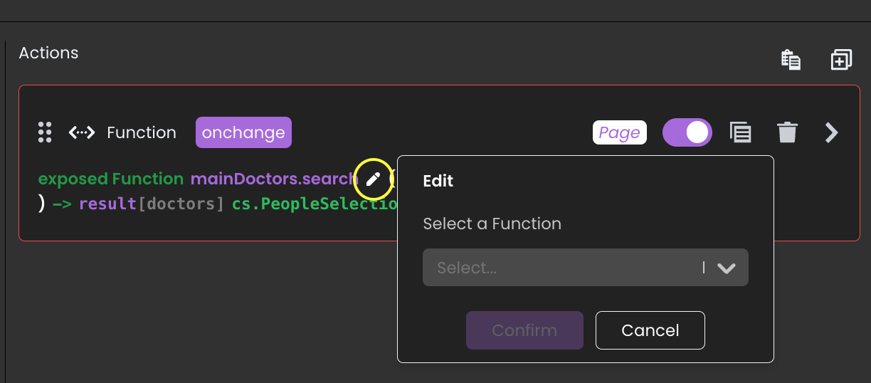
You’ll save so much time thanks to this new feature!
This is the main feature of this release!
You can now modify the user interface (UI), styling, and other properties on the fly and tailor pages to specific privileges, Qodly Source values, contexts, or scenarios without relying heavily on server-side processing.
A state is defined by its differences from the original Qodly page, known as the Base state. States allow dynamic UI customization like conditional visibility or style modifications regarding the Base state.
On a Qodly page, create as many states as you need according to your use cases.
The real added value of this feature is that a state can be bound to a condition.
These conditions are based on criteria like privilege levels or Qodly source value (more criteria are detailed in the doc).
The state is enabled or disabled dynamically according to evaluating these conditions as TRUE or FALSE.
In the video below, you’ll see a quick overview of the power of states.
While creating states, you’ll also discover the powerful and user-friendly conditions editor, which can handle the most complex business logic!
Note that a state can also be enabled/disabled on server-side processing thanks to the new functions enableState() / disableState() available on the Web Form object.
Check the documentation to learn more. A series of tutorials will also be available soon.
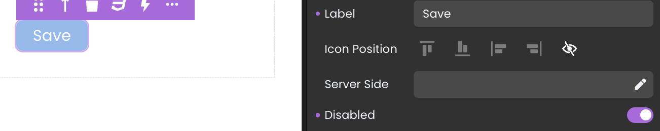
Following on from the States feature, components can be disabled thanks to a new Disabled property.
When disabled, events set up for this component are not triggered, and it has a particular rendering.
Want to disable a button until the user has entered all the mandatory information? Just disable the button on the Qodly page (Base state) and create a state where it is enabled.
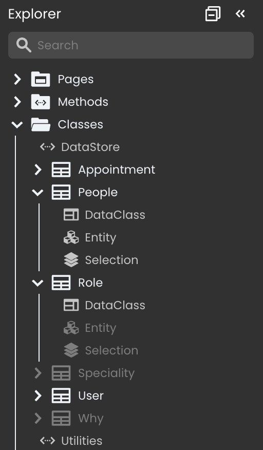
The ergonomy for the classes in the Explorer has been enhanced for better ease of use, especially if you have a complex data model.
The Datastore class always appears first.
The ORDA Data model classes appear second and are grouped by dataclass name. If empty, they are greyed out and can be created by simply clicking the class name.
The other classes appear in third.
With the 20 R5 release, you discovered dialogs.
They are now grouped in the outline and can be edited from there, improving visibility and ease of use.

We released singletons with 4D 20 R5, and with 4D 20 R6, Qodly Studio for 4D supports singletons. They can be handled with the explorer and the code editor.
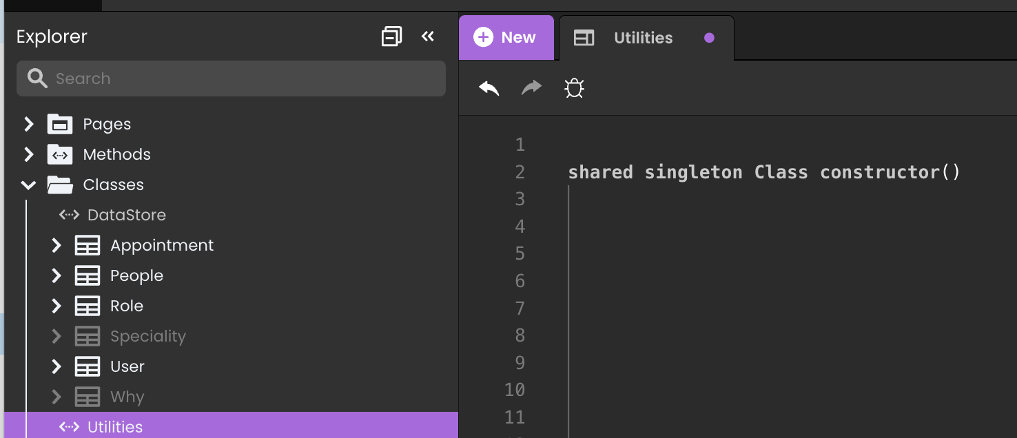
Singleton functions can be called and protected by permissions.
Read this blog post to learn more.
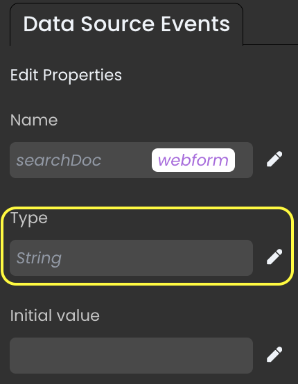
A scalar Qodly source type can be changed post-creation, eliminating the need to delete and recreate the source.
A new standard action is available. It allows entity selections to be cleaned of their deleted entities, preventing blank spaces in the UI.
In the video below, a person entity is first deleted without using the clean standard action, causing empty lines in the datatable. Secondly, the clean standard action is used, and empty lines vanish.
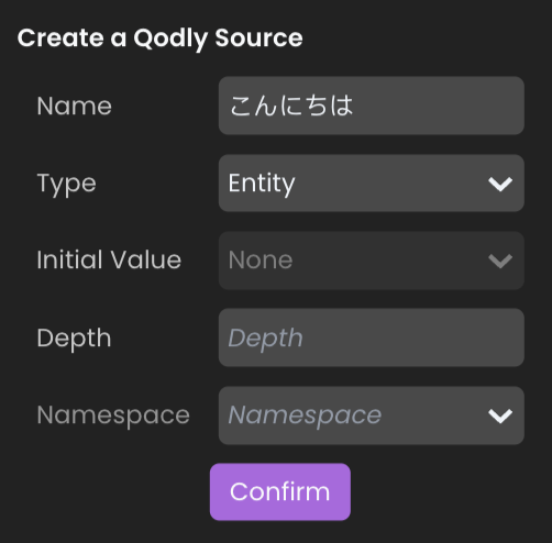
Qodly studio now supports Japanese characters for artifacts you might create with Qodly studio (Qodly source names, Qodly page names … etc.)
You can now select an image from the shared folder and drag and drop it directly on the image source property or the default image source property.
Got a question, suggestion or just want to get in touch with the 4D bloggers? Drop us a line!
* Your privacy is very important to us. Please click here to view our Policy
Comments are not currently available for this post.