
The making of the new 4D v19 logo
April 5, 2021
2 min read
by Julien Banon, UX and Creative Designer at 4D SAS
4D v19 is just around the corner and while our teams are putting the finishing touches on one of the best LTS yet, I thought I’d tell you the story behind the 4D v19 logo design.
Apple made a graphic transformation of its icons for the transition to macOS Big Sur. It consists of a shape change and some 3D effects. We decided to incorporate some of the guidelines for the 4D v19 icon.
The shape of the icons is standardized: it evolves to a square with rounded edges. The colored borders (if they existed), disappear.
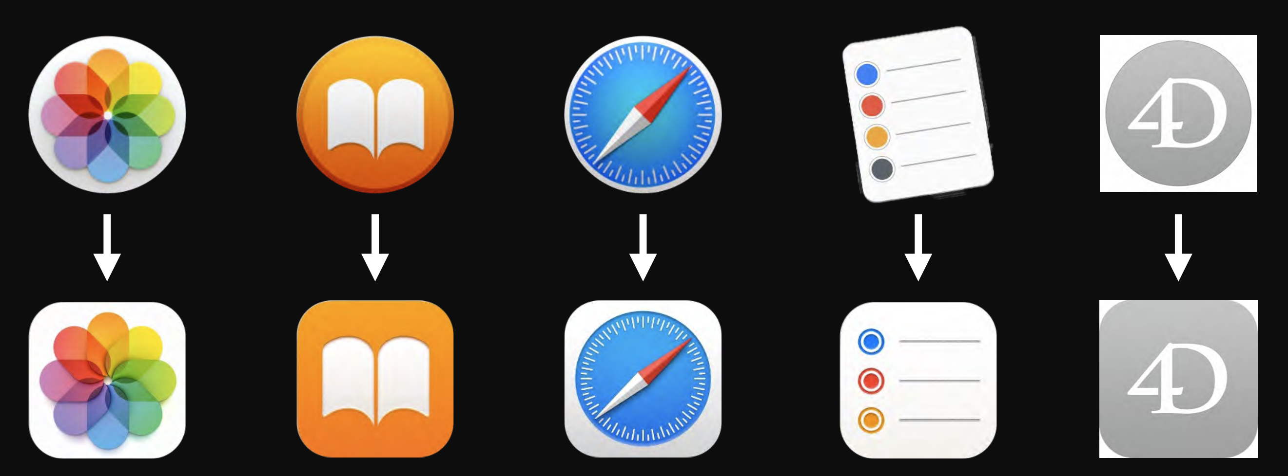
On a recurring basis, although not systematically, the graphic style evolves towards a three-dimensional effect. Drop shadows, highlights and colorful reflections appear.

We usually follow a linear progression on the color wheel. Which would place the 4D v19 icon in red tones: but then we would have too close to the 4D v18 and 4D v15 colors. We decide to position ourselves on a blue spectrum.

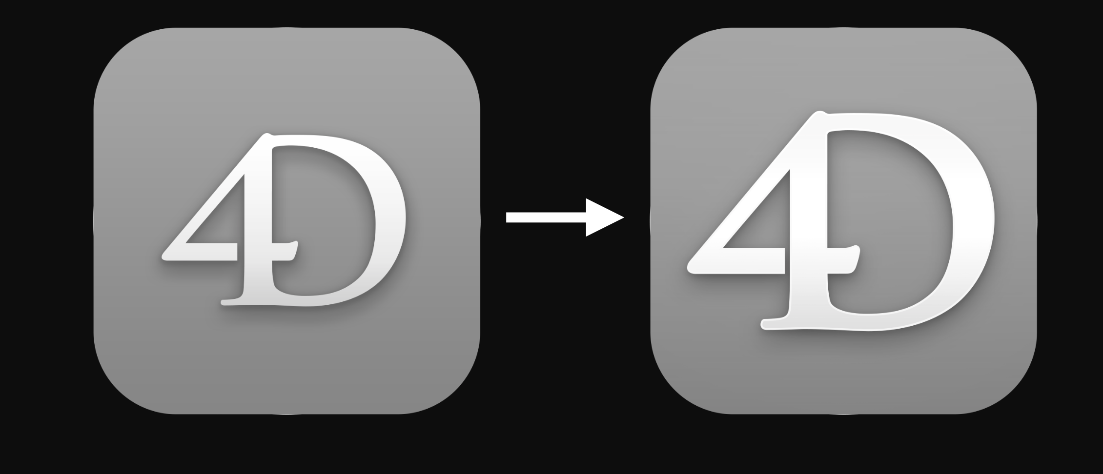
We’ve enlarged the size of the 4D pictogram inside the square and to increase the contrast with the background, we also added a thin white border to the 4D.
4D v19 Long Term Support icon:

Until 4D v18, the feature release icons were distinguished by their lower right corner. We’ve kept this principle for 4D v19 and adapted it to the square shape:


Got a question, suggestion or just want to get in touch with the 4D bloggers? Drop us a line!
* Your privacy is very important to us. Please click here to view our Policy
Comments are not currently available for this post.