
4D Qodly Pro: What’s new in 4D 20 R10
August 18, 2025
6 min read

4D 20 R10 is now available and offers a new set of 4D Qodly Pro enhancements throughout the product to stabilize powerful features you might have already used.
Setting up HTTP handlers is now easier than ever.
When rendering a page, URL parts and parameters can now be accessed. And so many enhancements will help you offer your end users a better understanding of their user journeys and clear feedback for each of their actions.
Keep discovering this powerful fully-part-of-4D web development solution, robust and user-friendly.
Build business web applications with minimal coding effort by leveraging the existing business logic you’ve already implemented in your desktop applications.
Let’s take a closer look … Keep reading!
In the previous What’s new blogpost, we introduced the new HTTP handlers UI.
You might have already read this blog post about HTTP handlers.
With the introduction of HTTP Request Handlers on the 4D HTTP Server, you can accurately define which business logic you want to trigger based on specific request URL patterns.
To offer a smooth and more intuitive user experience during your handlers set up, this UI has been enhanced.

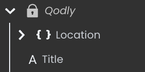
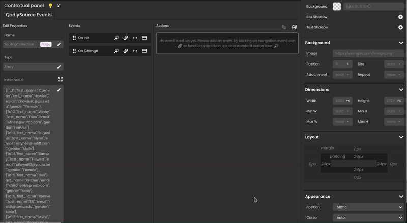
A Qodly namespace is now available by default. It contains shared Qodly sources:
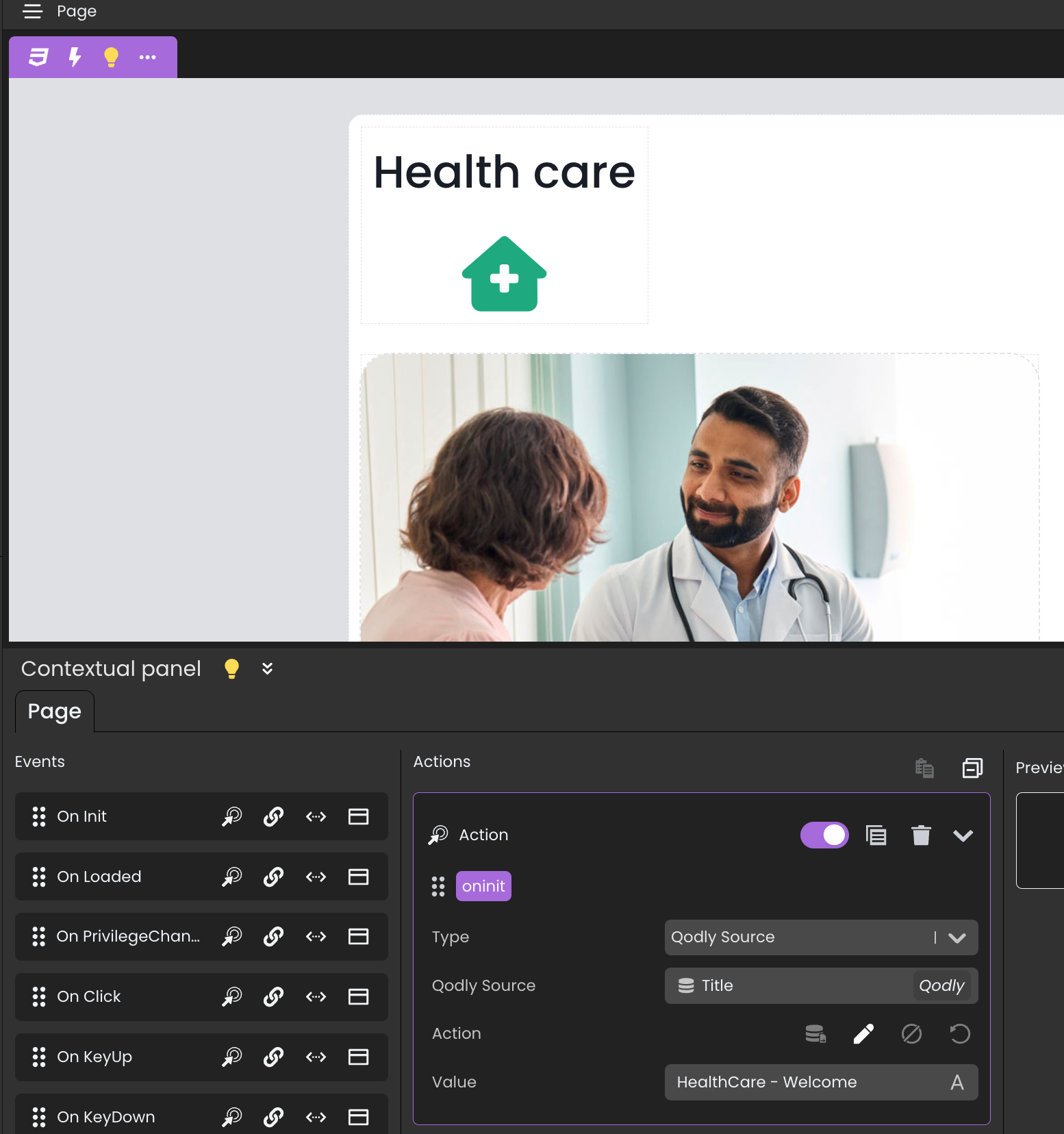
To give your end users a better understanding of where they are in their user journey, you can now set a custom title to the browser tab.
Before, the tab title was the current Qodly page name. Now, thanks to the new Title shared Qodly source, you have full control of the browser tab title.
In the example below, a single Qodly page is used: the HealthCare page. It contains a page loader displaying the required page according to the user’s navigation actions.
To avoid the browser tab title from always displaying “HealthCare”, you can now set a value for the Title Qodly source anywhere in your app.
On the Authentication page, when the page is initialized, the title is set dynamically:
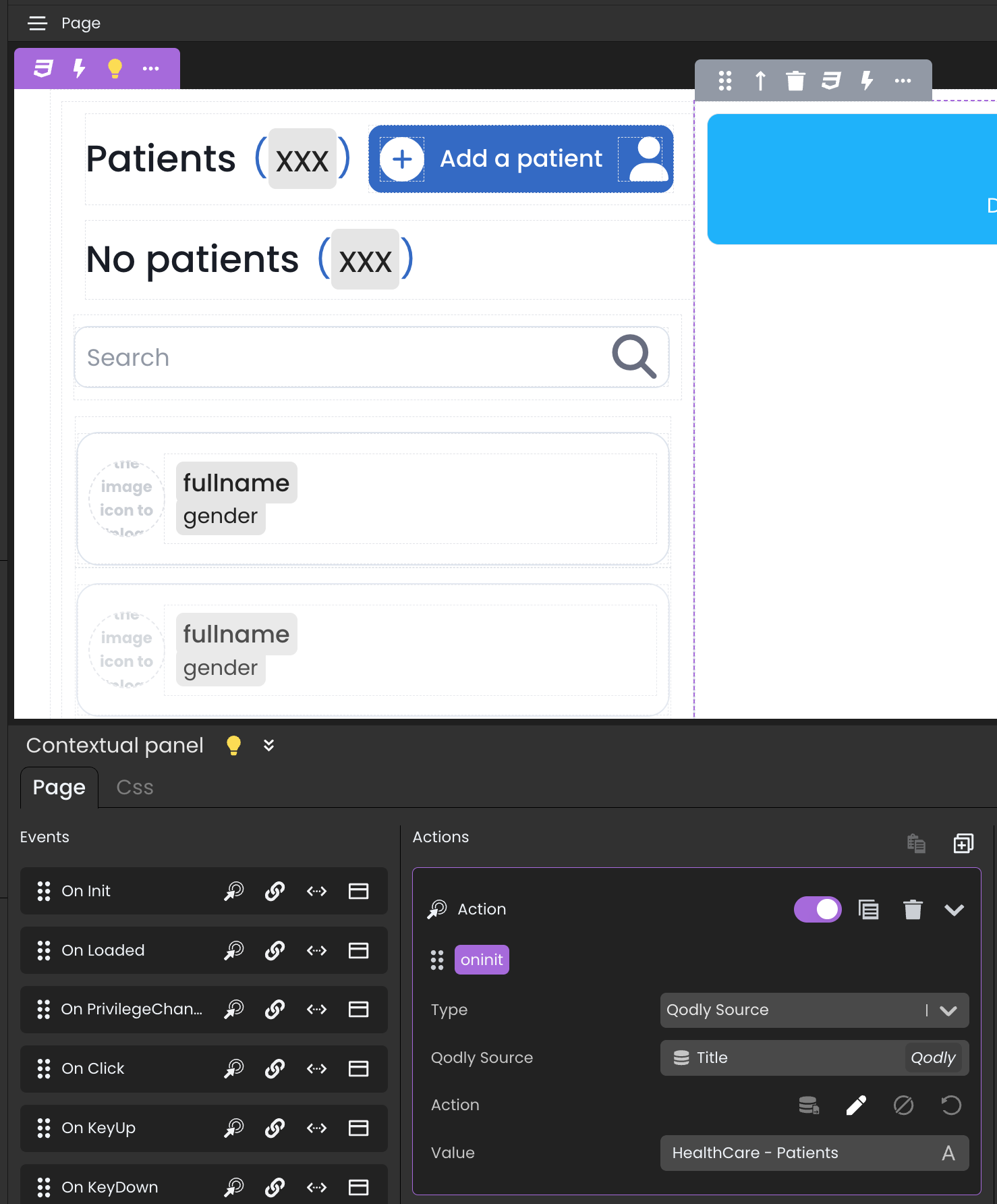
The same approach applies to the Patients page and other pages in your app:
Here’s what it looks like in action:
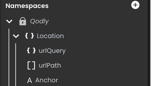
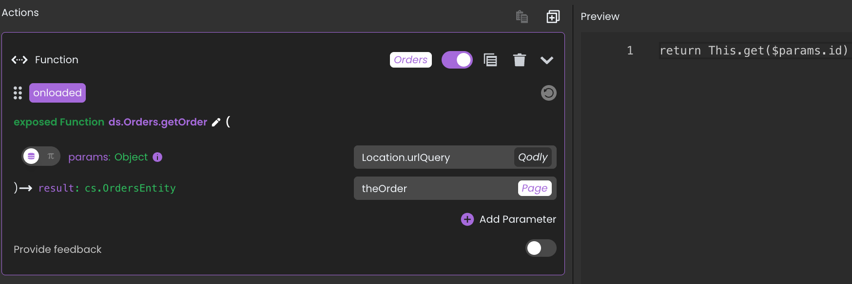
You can now get the URL parts, parameters and anchor of a rendered Qodly page URL thanks to the Location Qodly source (Object).
This works similarly to the 4D.IncomingMessage class instance received as parameter by HTTP handlers.
For example, this kind of URL can now be handled during a Qodly page rendering (e.g., the Orders page): http://127.0.0.1/$lib/renderer/?w=Orders&id=11
Thanks to the Location object source, a function can be called when the Orders page is loaded to retrieve the order with ID 11:
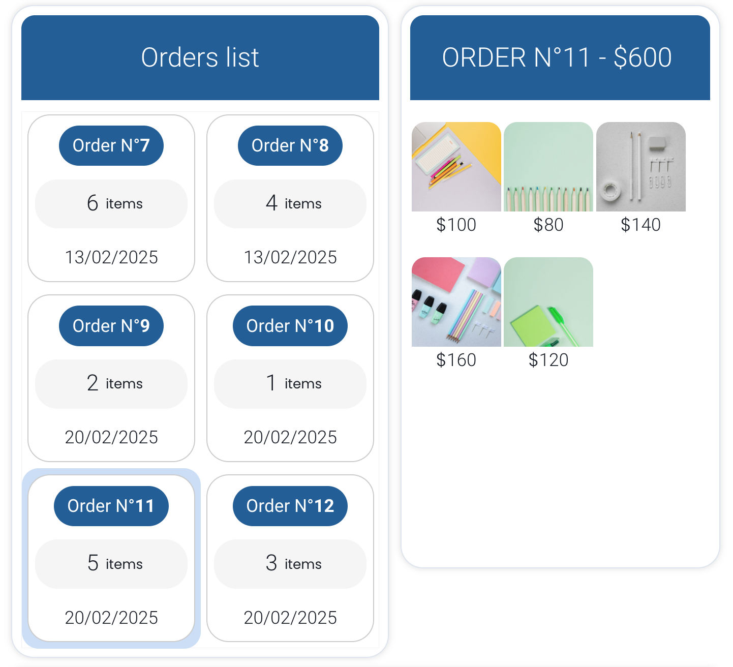
Because theOrder source is the selected element of the matrix below, that order is automatically selected.
A new Selection behavior option is available for the matrix component to define how selection behaves when the data bound to the matrix changes.
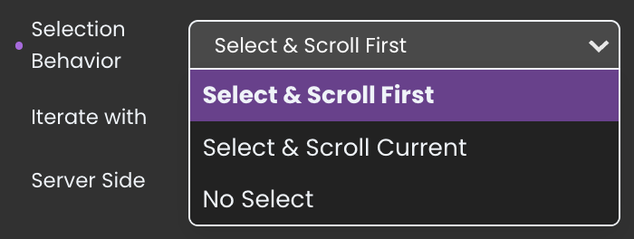
Three options are available:
When the data changes, the matrix scrolls to the first element and selects it.

The currently selected element remains selected, and the matrix scrolls to it (if it’s included in the updated data bound to the matrix)
No automatic selection is made. If needed, the developer must manually select an item using functions or standard actions.
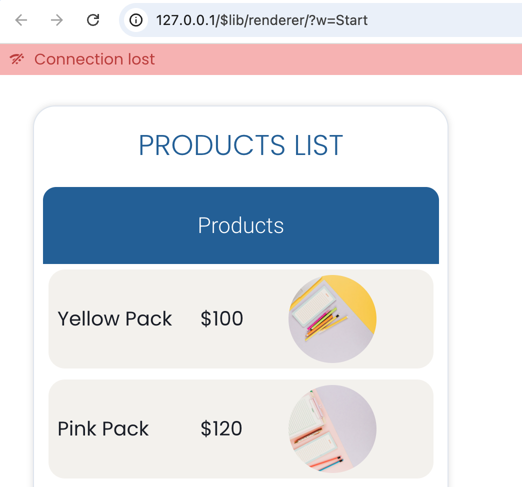
Network connection lost? No code needed — it’s now automatic when rendering a Qodly page. A message appears when the connection drops…
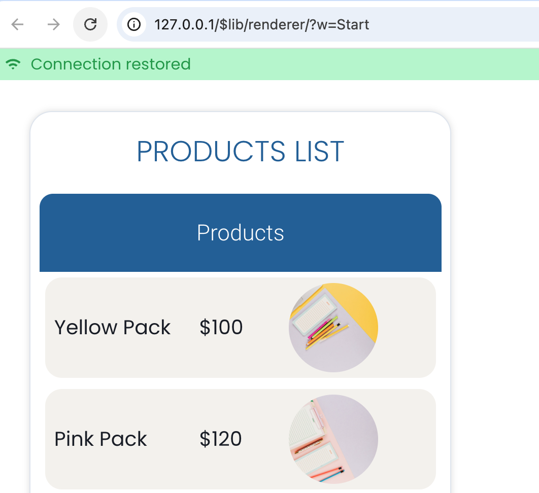
…and disappears when it’s restored:
The text input component has been enhanced for Date type entries. When suggesting intervals via a Qodly source bound to the component, a new Boolean active property can now be used.
If this property is true or missing, the interval is applied. If it is false, the interval is ignored — just like enabling/disabling it in the Properties panel.
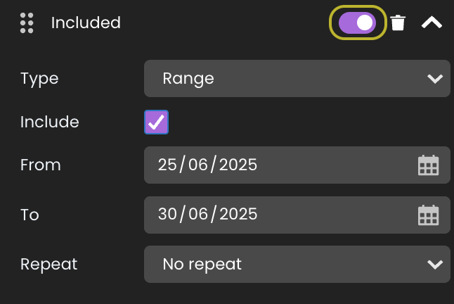
Given this intervals Qodly source:
[
{
"include": true,
"type": "range",
"params": {
"from": "2025-06-25",
"to": "2025-06-30"
},
"active": false
}
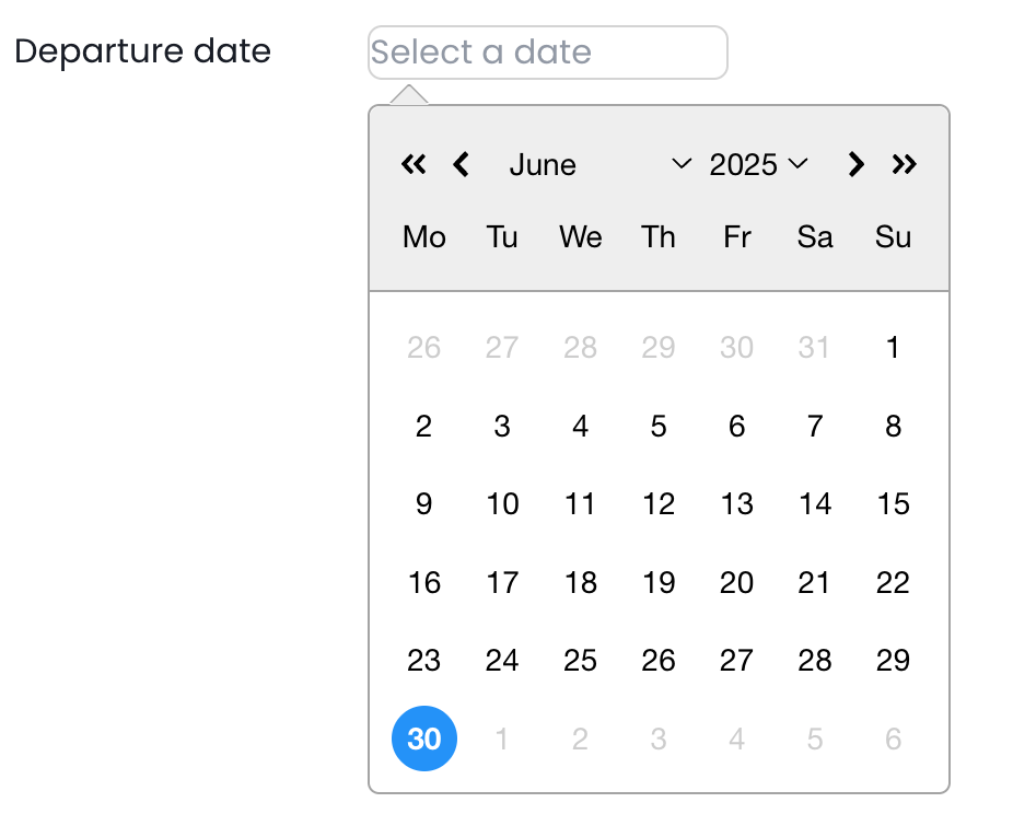
]Because the interval is ignored (active is False), all dates remain available:
Now given this other intervals source:
[
  {
    "include": true,
    "type": "range",
    "params": {
      "from": "2025-06-25",
      "to": "2025-06-30"
    }
  }
]
Since the active property is missing, it’s considered True, and the interval is applied.
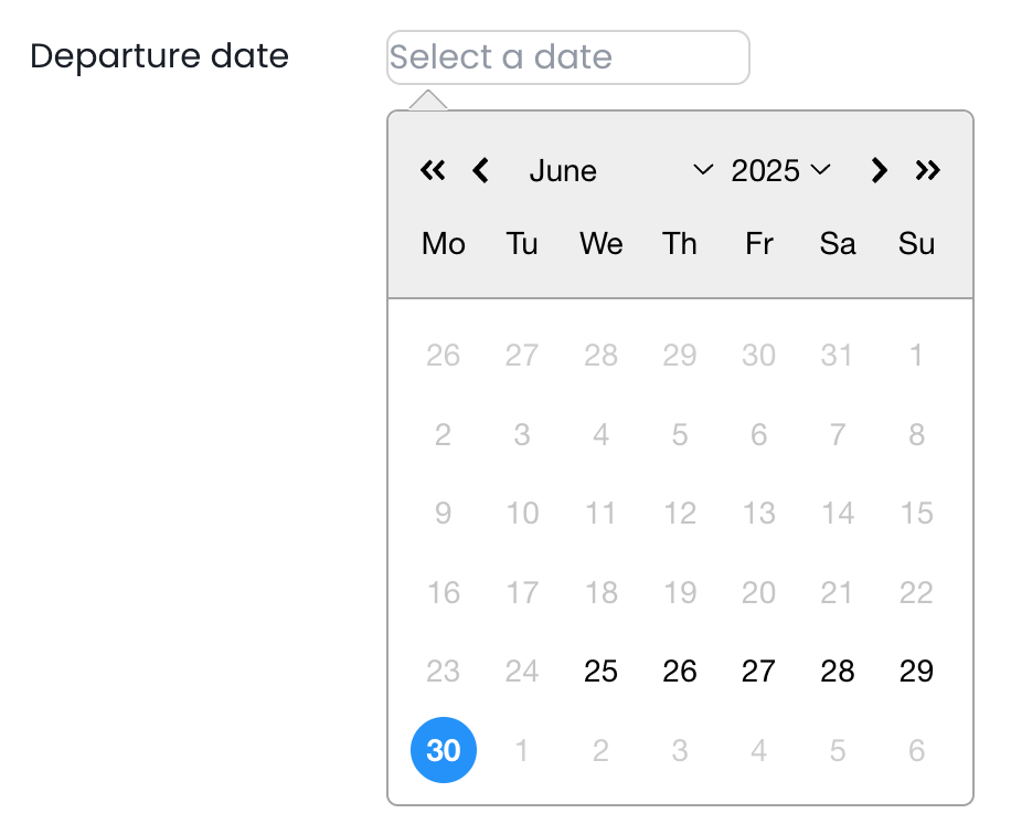
You’ll also appreciate easier navigation in the date picker.
If you are using qodlysources for intervals with your date text input components, be aware some properties have been renamed:
Here is an example:
[
  {
    "include": true,
    "type": "startingFrom",
    "params": {
      "today": true
    }
  }
]The Qodly source initial value editor has been enhanced to offer a better and smoother user experience when working with long values. No need to put your glasses on — it’s crystal clear!
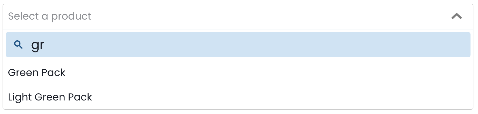
The search bar of the select box component can now be styled using new CSS selectors:
Here is an example of a CSS class you can apply:
self {
	.fd-selectbox__search {
		 border-width: 0.5px;
                 border-color:  #1f5f93;
	}
	.fd-selectbox__search__input {
		background-color: #d5e7f6;
		font-size: 20px;
	}
	.fd-selectbox__search__icon {
		color:  #1f5f93;
	}
}
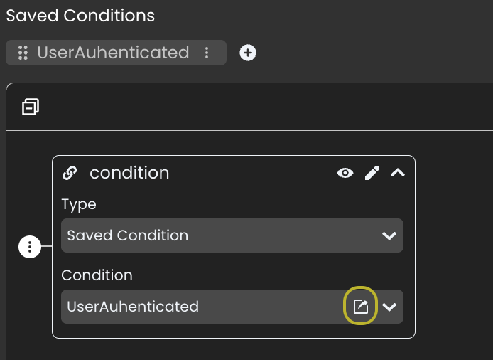
While editing a state, if it involves a saved condition, there’s now a shortcut to edit it directly.
Need a refresher on states? Read this blog post to (re)discover how to handle a dynamic UI.
That’s it!
We hope all these enhancements help you build even better Qodly web apps.
Stay tuned!
Got a question, suggestion or just want to get in touch with the 4D bloggers? Drop us a line!
* Your privacy is very important to us. Please click here to view our Policy
Comments are not currently available for this post.