
Customize Buttons, Radio Buttons, and Check Boxes with Background and Border Properties

October 19, 2026
3 min read
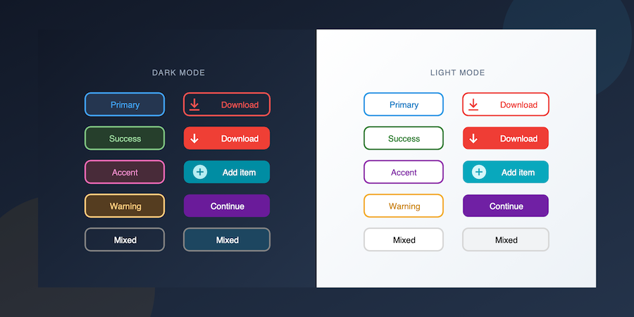
Imagine you’re building a toolbar with colorful action buttons, or a settings panel with styled radio buttons and check boxes. You don’t need custom artwork or complex graphics, just a blue button with rounded corners and a subtle border.
Until now, even simple visual customization required creating dedicated image assets.
Starting with 4D 21 R5, you can set a background color and border properties directly on custom-styled buttons, radio buttons, and check boxes.
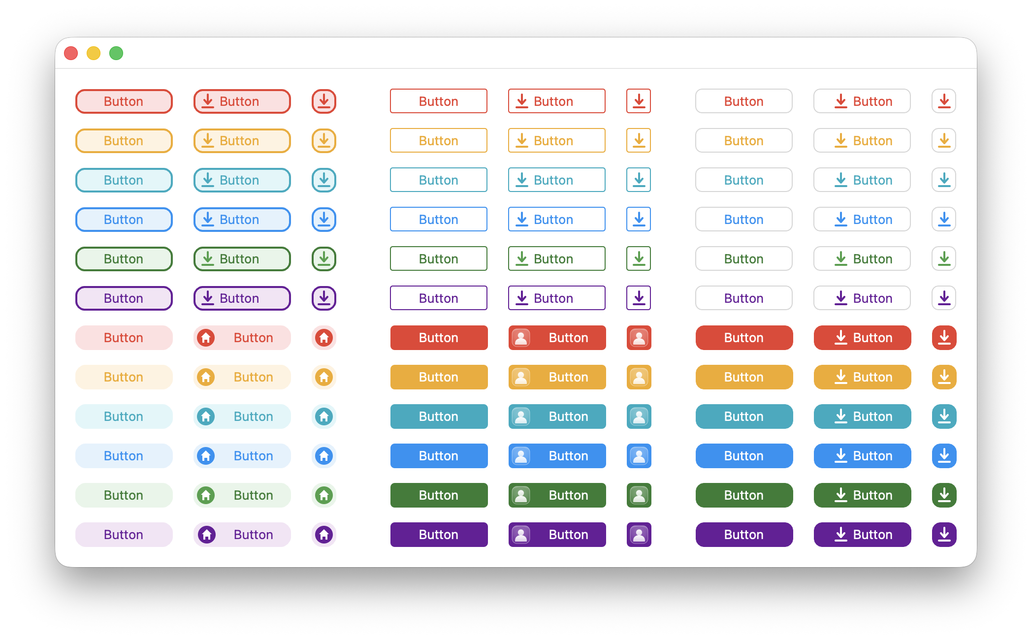
Light mode
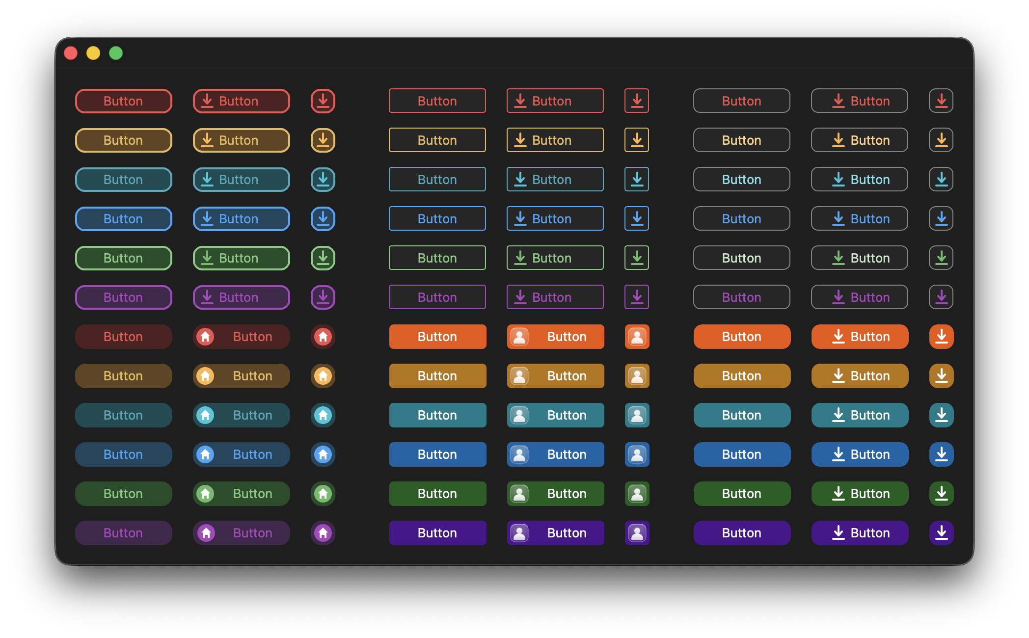
Dark mode
Previously, customizing the background color of a custom-styled button, radio button, or check box required using a background image. Now, you can define a background color in the Form Editor or change it at runtime using 4D commands.
Property list for Button
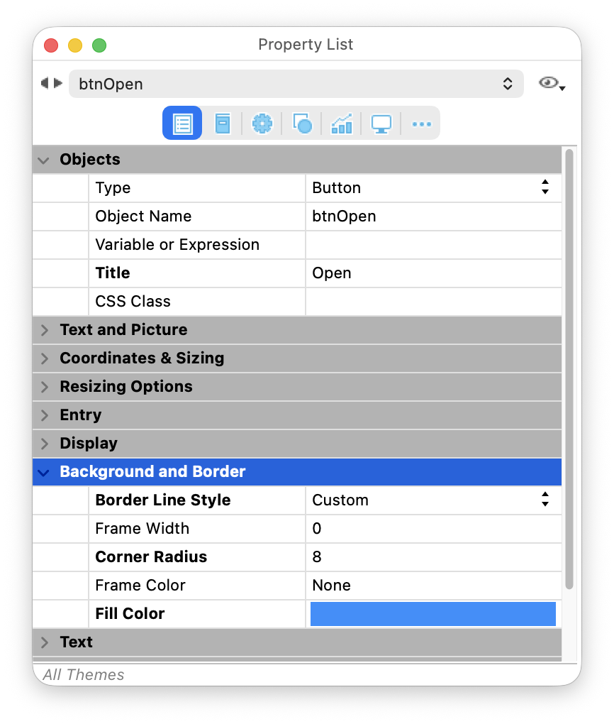
Property list for Radio Button
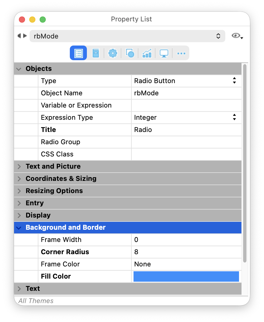
For buttons, a new “custom” border style has been introduced to preserve backward compatibility. It enables the new background property without changing the appearance of existing buttons.
// Set a blue background on a custom-styled button
OBJECT SET BORDER STYLE(*; "myButton"; Border custom)
OBJECT SET RGB COLORS(*; "myButton"; 0xFFFFFF; 0x1E90FF)

// Set a blue background on a custom-styled check box
OBJECT SET RGB COLORS(*; "myCheckBox"; 0xFFFFFF; 0x1E90FF)
The default value is “none”, preserving the appearance of existing forms. When a background image is present, it is rendered on top of the background color, allowing you to combine colored backgrounds with transparent icons or images.

You no longer need dedicated image assets just to add a border. New border properties let you customize the appearance of your custom-styled buttons, radio buttons, or check boxes directly:
Whether you prefer subtle outlines or rounded action buttons, everything can now be configured directly from the Form Editor, CSS, or 4D code.

And when you combine rounded corners with a background image or a background color, 4D automatically clips the background to the border. No masking or image editing required.

For buttons, these new properties are available only when the Border Style is set to “custom”, preserving the appearance of existing forms.
// Set a border radius on a custom-styled button
OBJECT SET BORDER STYLE(*; "myButton"; Border custom)
OBJECT SET CORNER RADIUS(*; "myButton"; 2)

// Set a border radius on a custom-styled check box
OBJECT SET CORNER RADIUS(*; "myCheckBox"; 2) If your application already uses CSS, these new properties fit naturally into your existing styling. Define a style once and apply it wherever you need it.
@media (prefers-color-scheme: light) {
    .custom-style-class {
        borderStyle: custom;
        borderRadius: 10;
        borderFillColor: #e0f7fa;
        borderColor: #00ACC1;
        customBorderX: 1;
        iconFrames: 4;
        textPlacement: right;
        imageHugsTitle: false;
        stroke: #00ACC1;
        textAlign: center;
    }
}
@media (prefers-color-scheme: dark) {
    .custom-style-class {
        borderStyle: custom;
        borderRadius: 10;
        borderFillColor: #164B52;
        borderColor: #45A9B9;
        customBorderX: 1;
        iconFrames: 4;
        textPlacement: right;
        imageHugsTitle: false;
        stroke: #45A9B9;
        textAlign: center;
    }
}
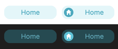
This makes it easier to create a consistent visual identity across your forms while reducing the number of image assets you need to maintain.
Image-based objects remain the best choice when you need a different appearance for each state. But for the many cases where a simple colored button, radio button, or check box is enough, background and border properties provide a much faster and easier solution.
Configure them in the Form Editor, style them with CSS, or update them from code, the result is the same: fewer image assets to manage and more time spent building your application instead of editing graphics.
Got a question, suggestion or just want to get in touch with the 4D bloggers? Drop us a line!
* Your privacy is very important to us. Please click here to view our Policy
Comments are not currently available for this post.